Summary
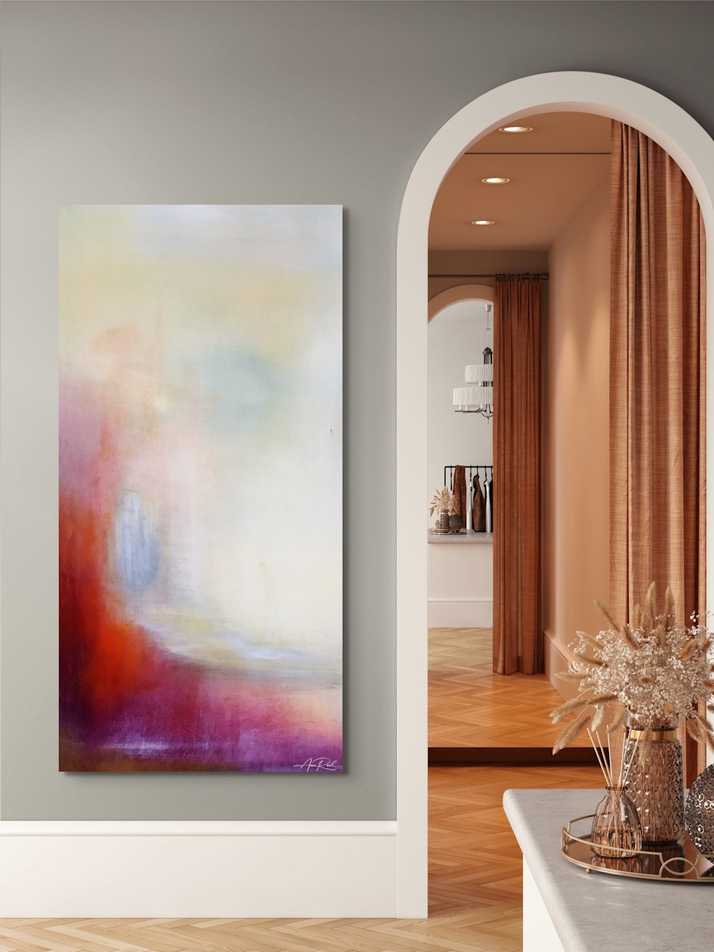
Pearl Gate 2, print presents a luminous threshold—soft whites and pearl light warmed by quiet reds and violets. The atmosphere is tranquil and anticipatory, inviting reflection in homes, hospitality interiors, and sacred spaces.
Artwork Statement
I composed Pearl Gate 2 around the idea of approaching light. A faint doorway emerges through layered glazes, suggesting revelation without insisting on it—an entry point that invites, not demands.
Color & Mood
- Palette: pearl white, warm ivory, soft gold, quiet violet and crimson veils.
- Mood: serene, hopeful, contemplative.
- Effect: calms transitional spaces; adds gentle radiance without glare.
Design Notes
- Layered glazes create a misted threshold effect.
- Balanced light/dark at the base grounds the composition.
- Reads cleanly at distance; subtle texture rewards close viewing.
Where It Works
- Entries, hallways, prayer corners, and meditation rooms.
- Hospitality: boutique hotel corridors, lounges, and quiet rooms.
- Healthcare and wellness settings seeking soft, non-literal calm.
Print Options & Materials
- Fine Art Paper — archival matte; frame under UV-protective glazing.
- Canvas — gallery-wrapped; painterly surface with minimal glare.
- Metal — sleek, durable, humidity-friendly.
- Acrylic — luminous depth and crisp edges.
Scripture (reference)
“The twelve gates are twelve pearls—each gate made of one pearl. And the street of the city was pure gold, clear as crystal.”
Revelation 21:21
Integrity Notes
- Source: high-resolution studio photography of my original painting.
- Adjustments: light tonal balancing and minor cleanup for print fidelity; no AI generation.
- Substrate differences may produce subtle shifts in sheen and depth under various lighting.
Notes from the Studio
Open Edition Fine Art Print from the original painting (Pearl Gate 2, acrylic on canvas, 48 × 24 in; in private collection).
Need sizing or placement advice? Contact me at: info@annereidartist.com