Art That Speaks: Stories, Scripture & Color
Aug 14, 2025
Art That Speaks: Stories, Scripture & Color
I don’t chase an image onto the canvas. Like Michelangelo, who said the sculpture was already in the marble, I look to see what the painting is showing me it wants to be. My work doesn’t begin with a fixed vision; it begins with seeing — waiting for the forms, colors, and movement to emerge and tell me their story.
Often, the stories I rediscover while painting are rooted in scripture. Not because I set out to illustrate a verse, but because, somewhere in the process, the scripture comes to mind — as if the painting itself is whispering it back to me. Seed of the Woman is one example. I was well into the work before the biblical narrative rose to the surface, shaping the meaning of what had already formed. This happens often — the art reveals the story as I go.

When the Process Breaks the Pattern
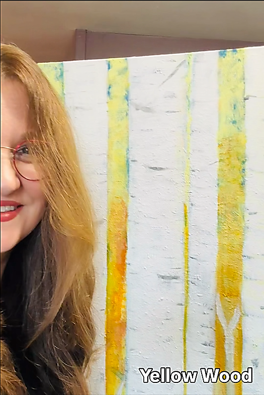
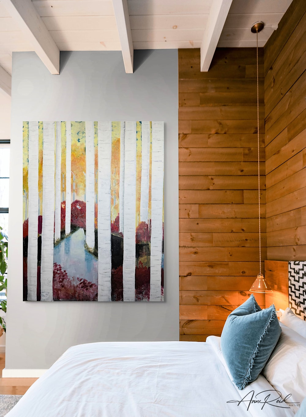
Most of the time, my work follows this organic rhythm. But Yellow Wood was different — an exception to my usual creative process.
The story began as a commission. A designer hired me to create a large birch tree painting for their client — a 48 x 60 acrylic on canvas. The deadline was Christmas 2019. I worked hard to give them what they wanted, but they didn’t accept it. I tried again, extending to Valentine’s Day, but that version wasn’t accepted either. Then the world went into lockdown.
I saw it as a huge failure. I doubted my ability, questioned whether I should take commissions at all. The truth is, Yellow Wood would not exist without that commission — but it was never meant for that client. The commission was the spark, not the destination.
The restrictions I was working under — trying to meet someone else’s vision — felt like an artistic lockdown. I was bending my creative process to fit into a mold, and it was frustrating. Once the commission ended, the pressure was gone. I could let the painting speak to me again. That’s when the work began to flow.
A Parallel Journey
While I was painting, I didn’t know who the work was for. But over the course of three to four years, it found its rightful place — in the home of a woman I hadn’t met when I started.
Her journey to that home mirrored my own process with Yellow Wood. She and her husband had a vision to build in Muskoka, in a new community, leaving behind their hometown. They faced red tape, delays, the displacement of being between homes, and the physical challenge of building much of it themselves.
When the painting was finally complete, her home was too. Today, Yellow Wood hangs as the statement piece in their breathtaking wood-and-stone, cathedral-ceiling, open-concept kitchen, living, and dining space.
For both of us, it was “the road less travelled” — the prophetic heart of the piece, echoing Robert Frost’s poem The Road Not Taken. The painting has become part of both our stories.
The Freedom of Color
Regaining that freedom after Yellow Wood reminded me why I paint the way I do. Color, for me, is about beauty and composition, not rules or symbolism. I’m looking for what will make a piece as exquisite as possible.
I choose colors that inspire me — unusual combinations that make the canvas come alive. My palette often moves outside the box, breaking from the status quo, and that freedom is one of the things I love most about painting.
As a Christian, I have invited God to make His home in my heart and have hidden His Word deep within me. My art speaks out of that overflow.
My artmaking process is a conversation, where I am listening to what God is saying to me about a time, place, or a person. When someone takes a painting home, the conversation continues between them and God. Often they discover shapes, meanings, or connections I never saw myself — and those moments take my breath away.
The War Over Color
As a colorist, I naturally move outside the box. My palette is bold, unapologetic, and often unexpected. When I’m painting, color isn’t a calculated decision — it pours out of the overflow of my heart.
But in the real world, there’s a tension. Do I paint in the bold colors that feel alive to me, or do I temper them into something more neutral — something people will more readily hang on their walls? To color or not to color — that’s the question.
It’s the same tension you find in life: left brain versus right brain, dreaming versus practical, creative vision versus structured process. I’ve read that Steve Jobs at Apple kept two different teams — one with complete creative license, and one focused purely on process. Process leaves no room for mistakes. But in the creative process, there are no mistakes — only discoveries.
If you’re going to build anything of lasting value, you have to resolve this tension. It’s like the woman and her Muskoka home. It began as a dream, but it had to go through the long, painstaking process of permits, construction, and problem-solving before it became a place where family life could happen.
Making art as a business requires the same bridge. My originals are pure overflow — they are what they are. But with prints, I step into the design mindset. I think intentionally about how color, texture, and movement will live in a space, creating work that still carries the heartbeat of the original while harmonizing with interiors. It’s a way of translating the dream into something that works beautifully in the real world.
For People, Not Just Spaces
I don’t paint for spaces — I paint for the people who occupy them. My work belongs in the places where its message will be a constant reminder that it was created for that person. That they are seen. That they are loved. That their story is recorded and re-presented on canvas.
To know that someone was inspired by God to create a work of art for you is an indescribable gift to receive — and an honor for me to give.
Afterward, when I move into printmaking, I design for spaces. I want my prints to carry the life of the original while offering colors people can live with — art that brings beauty, presence, and a sense of story into the everyday.


